
Mariam Design
About
IMMOBILIEN WIMMER:
specializes in residential and commercial property brokerage, consulting, and management in Munich and nearby areas.
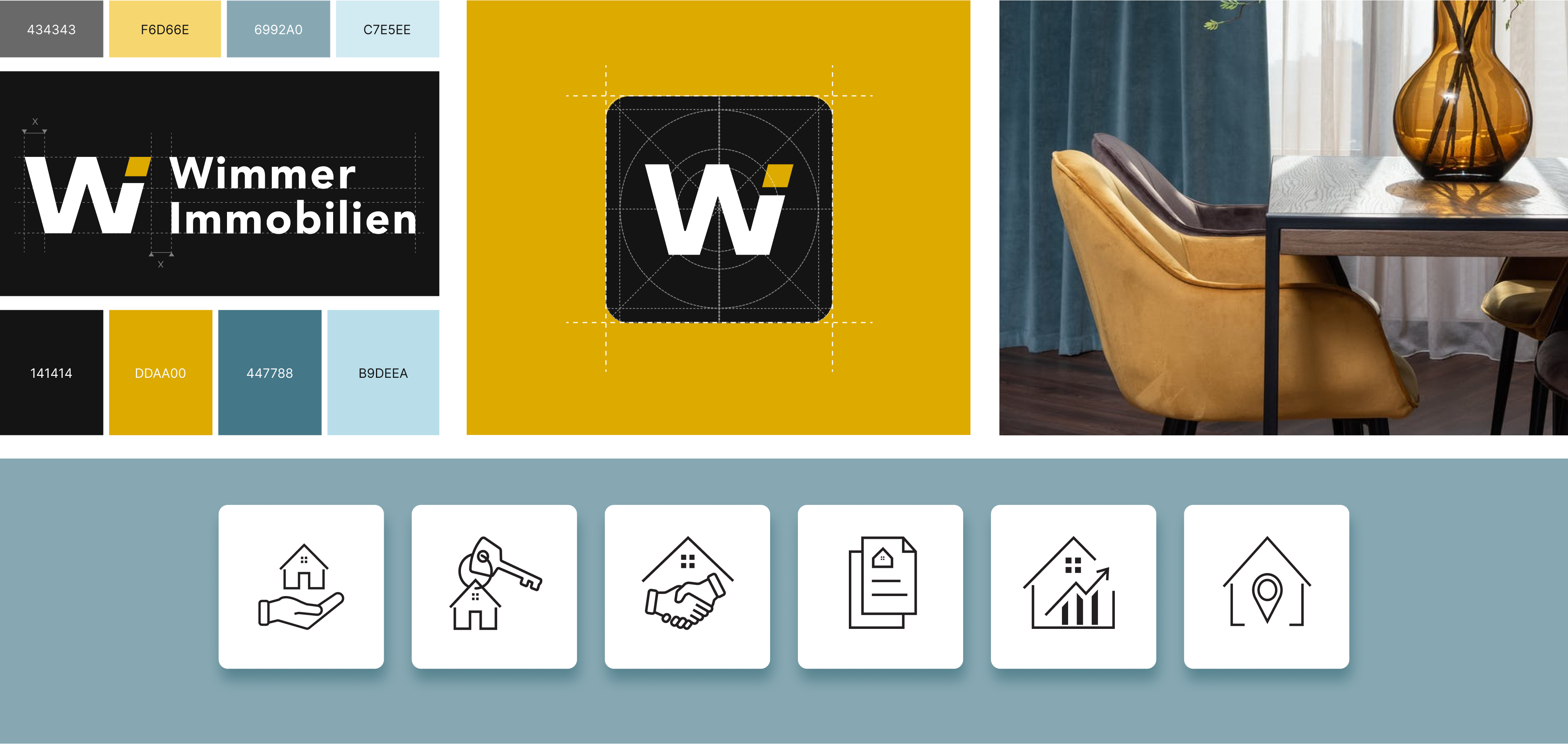
The new logo design draws inspiration from the initial letters of the client's surname, 'Wimmer', and the German word 'Immobilien', which means 'real estate'.
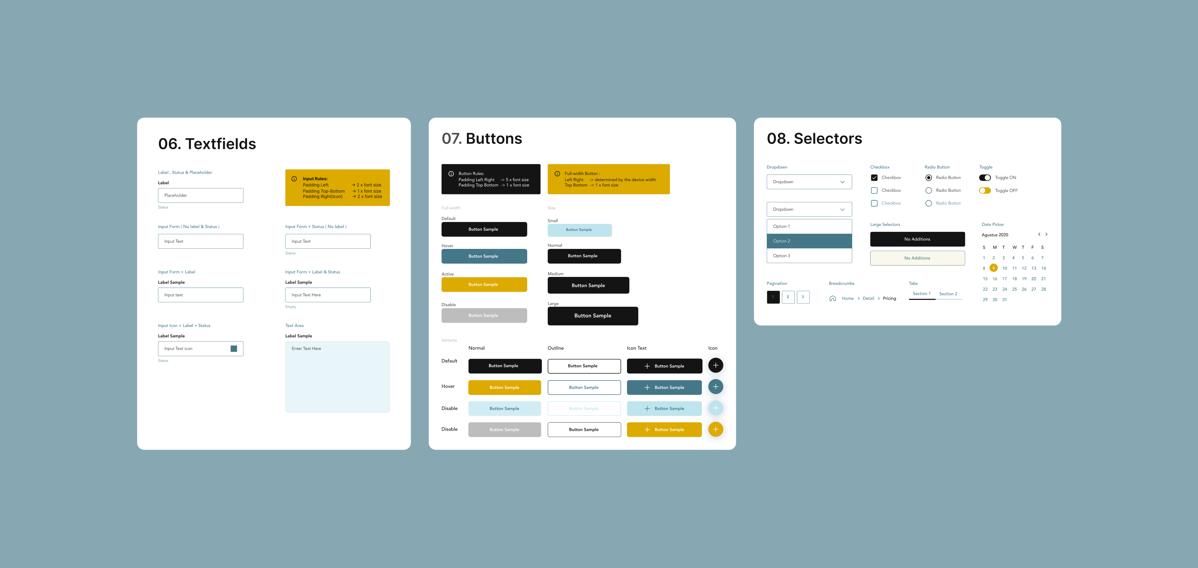
I created a comprehensive UI/UX Style Guide and Design Kit to maintain consistency and enhance the intuitive use of our brand elements across all platforms.
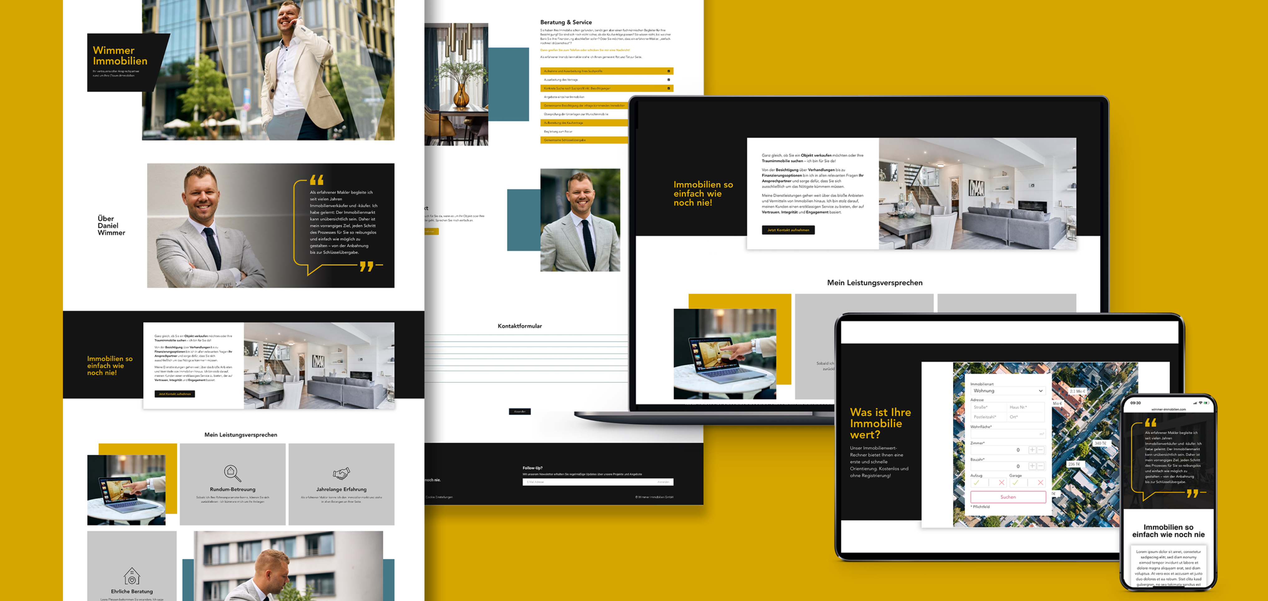
Responsive design is essential to ensure compatibility with a variety of hardware devices.
My Role as a Brand Designer:
I created a personal brand identity for a real estate entrepreneur, combining modern aesthetics with a sense of trust and professionalism. The visual language reflects his personality and expertise, applied consistently across web and print for a strong, cohesive presence.
My Role as a UI/UX Designer:
As a UI/UX designer, I led this project from initial exploration to final implementation. My role included understanding the brief, ideation, web and mobile Wireframing, creating a UI Style Guide and Prototyping.
I worked closely with the project manager and collaborated extensively with the engineers to ensure a seamless process.
Team:
- Project Manager
- UX Writer
- Photograph
- Engineers
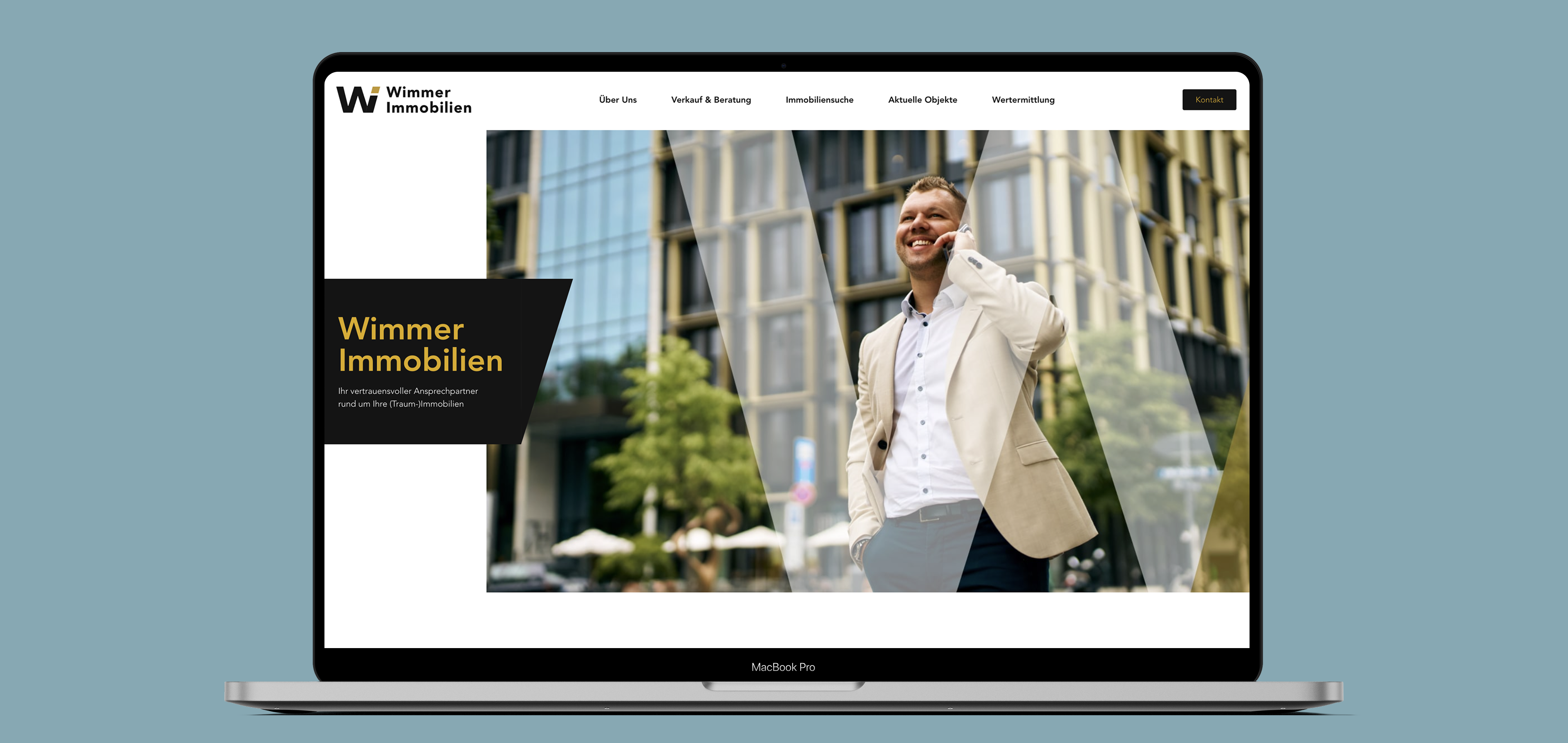
As the central point of external communication, the personal branding served as the main contact interface, with a primary focus on the client’s professional expertise and credibility.
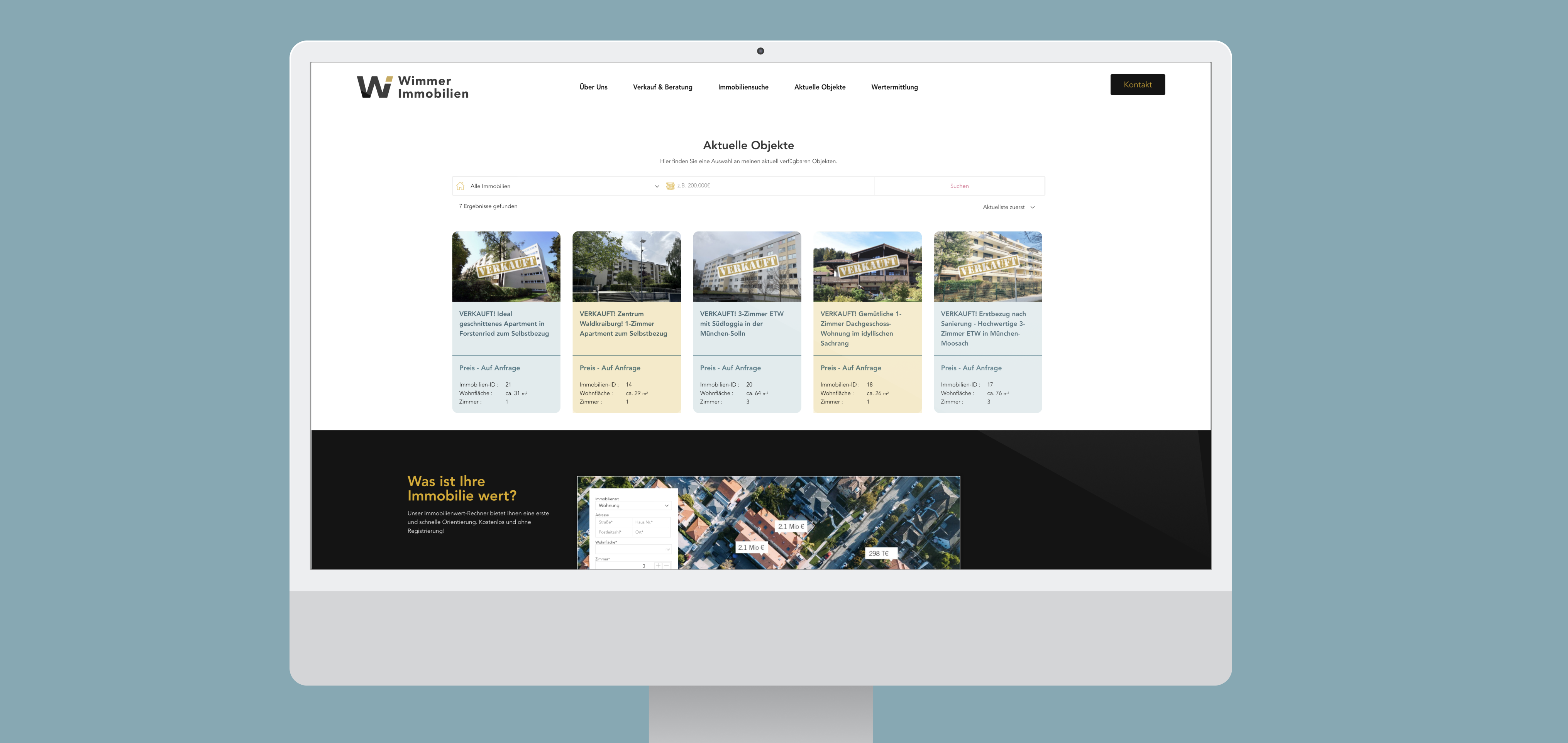
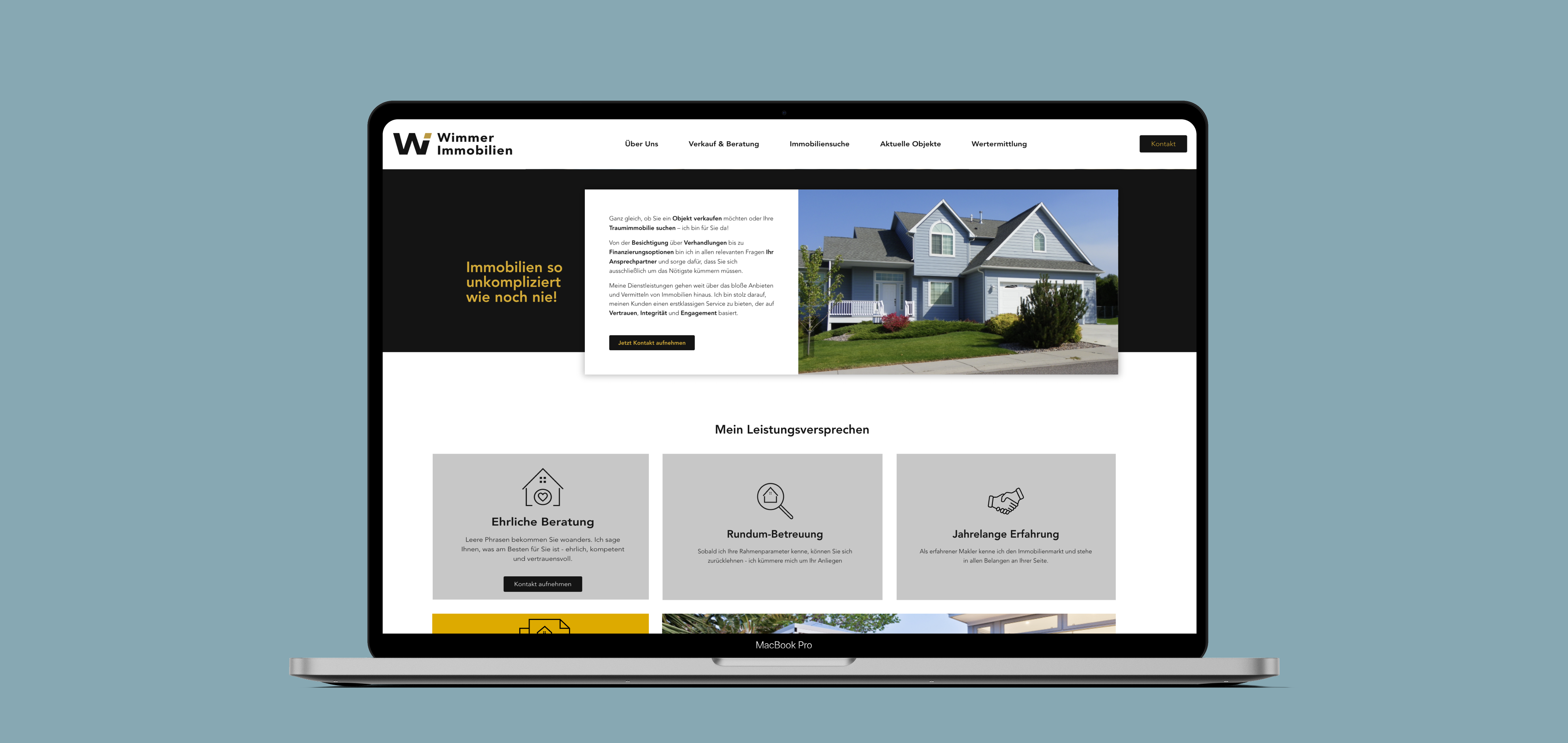
The deliberate use of corporate design colors adds individuality to the website, enhancing its memorability.
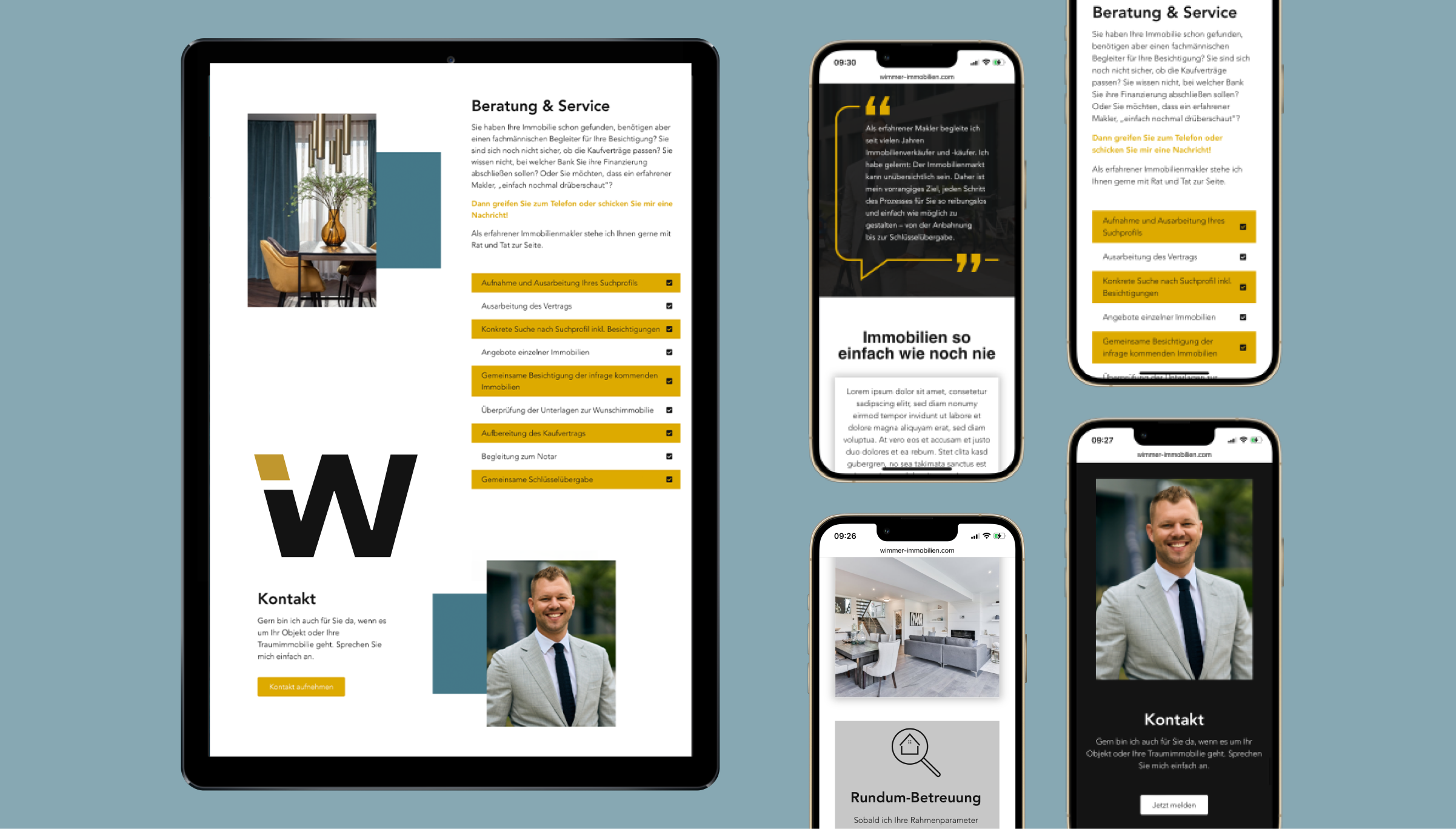
Mobile-first design focuses on small screens first, ensuring performance and usability across all devices.
Visit website

THE RESULT & LEARNING
This project was an opportunity to create a brand identity for a real estate firm’s first major digital transformation. The aim was a trustworthy, modern online presence that builds client confidence. We focused on clear, professional design for a seamless experience across all touchpoints.
DELIVERABLES
- Competitive Analysis
- Personas & User Journeys
- UI Style Guide & Design System
- Interactive Prototypes
- Brand Manual & Stationery
Mariam Design
About
Resume
IMMOBILIEN WIMMER:
specializes in residential and commercial property brokerage, consulting, and management in Munich and nearby areas.
Client workshop
Brand Identity
UI/UX
Style Guide
web design
The new logo design draws inspiration from the initial letters of the client's surname, 'Wimmer', and the German word 'Immobilien', which means 'real estate'.
I created a comprehensive UI/UX Style Guide and Design Kit to maintain consistency and enhance the intuitive use of our brand elements across all platforms.
Responsive design is essential to ensure compatibility with a variety of hardware devices.
My Role as a Brand Designer:
I developed a brand identity for a real estate entrepreneur, focusing on personal branding and creating a distinctive visual language. The aim was to create a modern, professional and trustworthy brand that reflects his personality and expertise. The visual language blends modern aesthetics with reliability, connecting with clients both emotionally and professionally. The branding was applied across web and print to create a consistent, impactful presence. This created a consistent and impactful presence.
My Role as a UI/UX Designer:
As a UI/UX designer, I led this project from initial exploration to final implementation. My role included understanding the brief, ideation, web and mobile Wireframing, creating a UI Style Guide and Prototyping.
I worked closely with the project manager and collaborated extensively with the engineers to ensure a seamless process.
Team:
- Project Manager
- UX Writer
- Photograph
- Engineers
As the central point of external communication, the personal branding served as the main contact interface, with a primary focus on the client’s professional expertise and credibility.
The deliberate use of corporate design colors adds individuality to the website, enhancing its memorability.
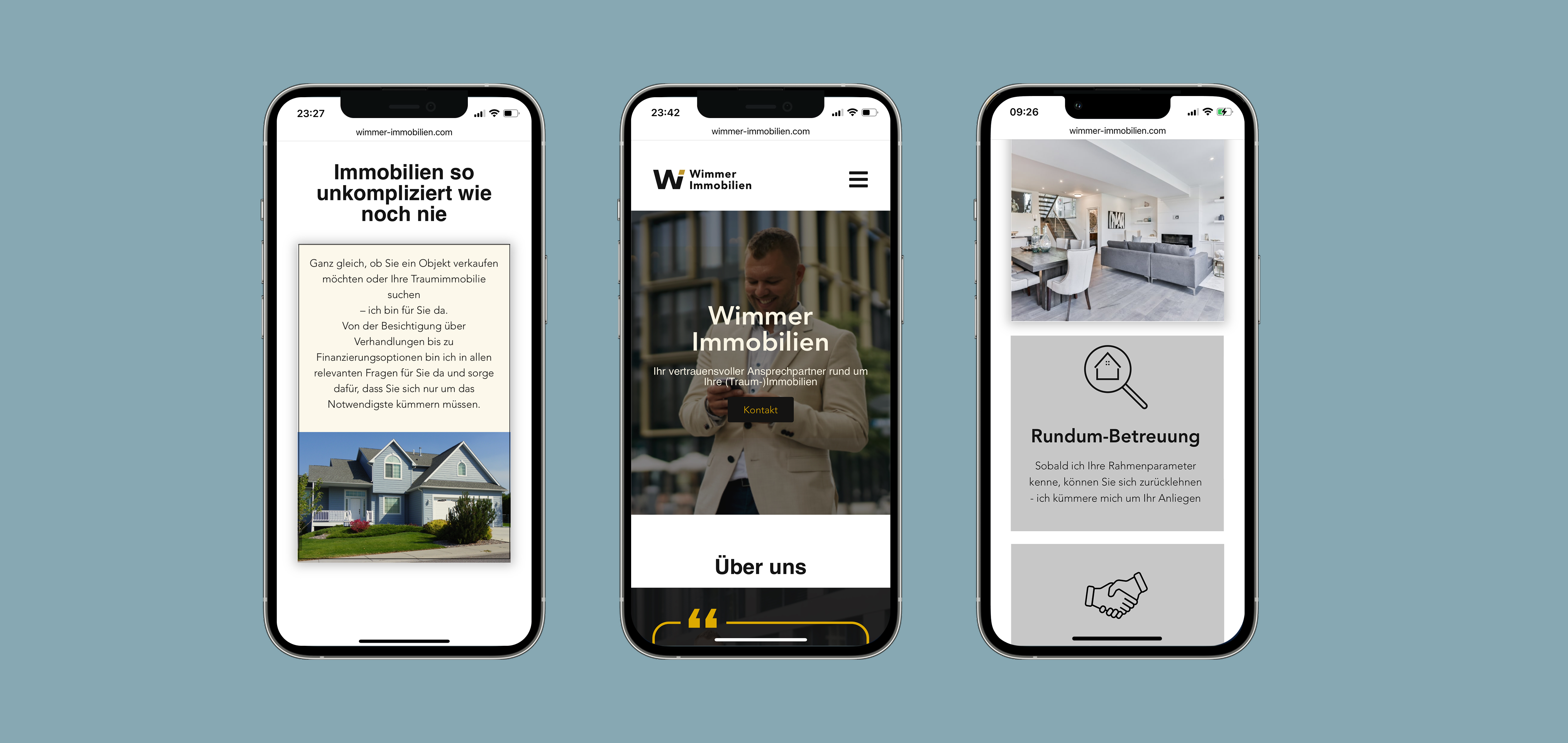
The mobile-first approach was also of great importance in this project to ensure an optimal user experience on mobile devices.
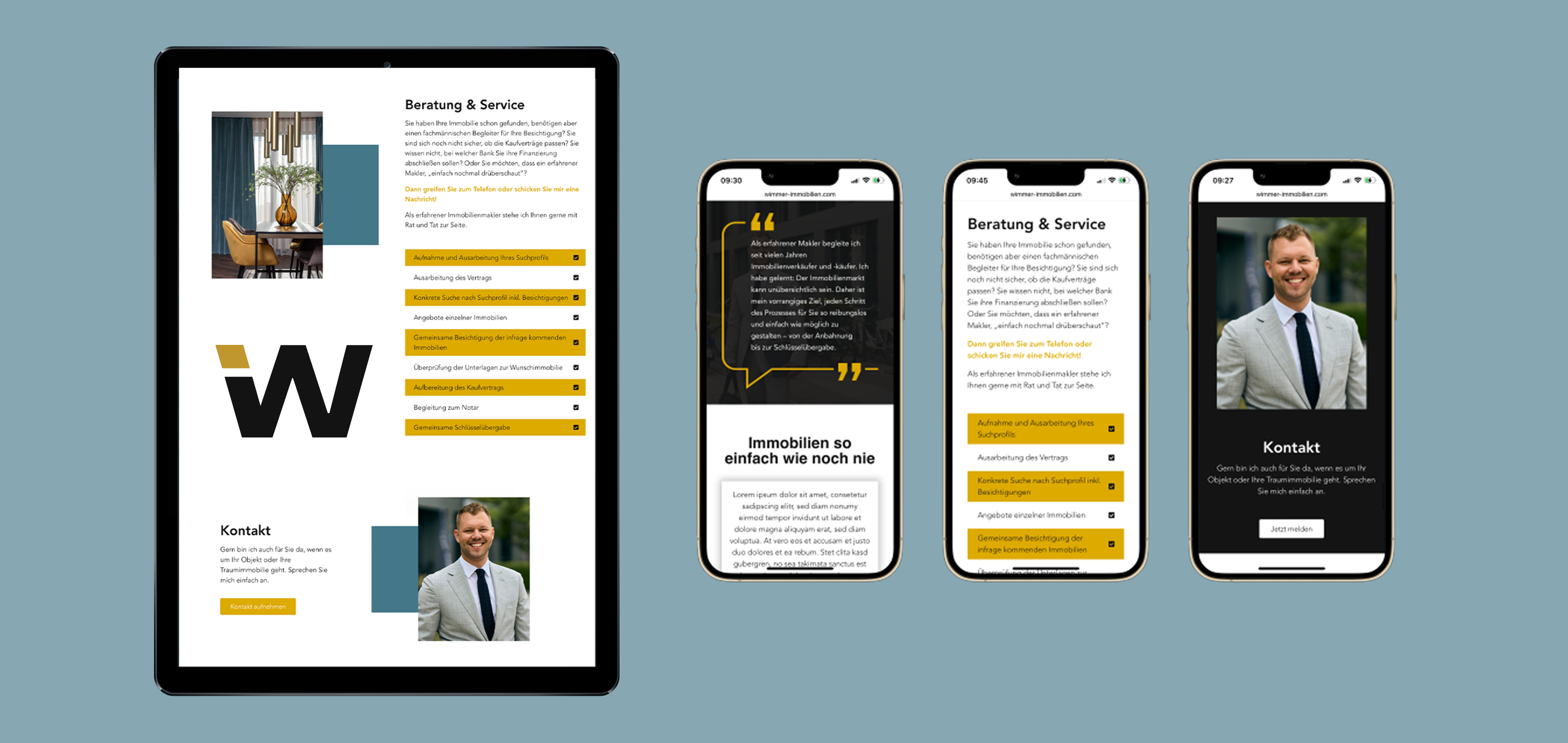
An elegant design that not only captivates the eye but also functions exceptionally well in vertical layouts, providing a seamless user experience across various devices and orientations.
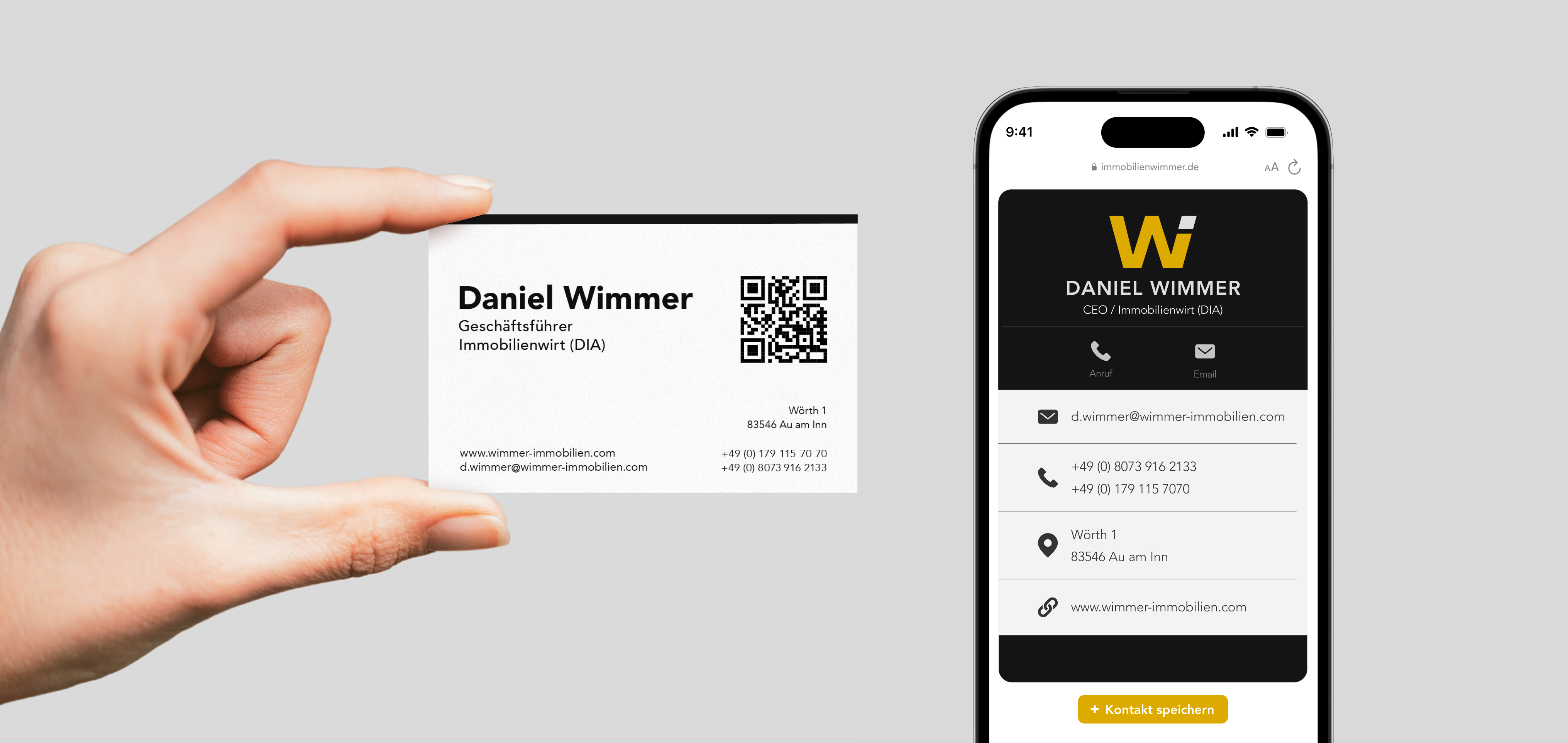
Business card with QR code as a link between the digital and physical worlds.
Visit website
THE RESULT & LEARNING
This project presented an exciting opportunity to develop a brand identity for a real estate firm that was undergoing its first significant digital transformation. The goal was to establish a trustworthy and modern online presence that would encourage clients to engage with confidence in property transactions. Through strategic design, we centralised key brand elements to ensure clarity, professionalism, and a seamless experience across all touchpoints.
DELIVERABLES
- Competitive Analysis
- Personas & User Journeys
- UI Style Guide & Design System
- Interactive Prototypes
- Brand Manual & Stationery
Next project
Back to Home

Mariam Design
About
Resume
IMMOBILIEN WIMMER:
specializes in residential and commercial property brokerage, consulting, and management in Munich and nearby areas.
Client workshop
Brand Identity
UI/UX
Style Guide
web design
The new logo design draws inspiration from the initial letters of the client's surname, 'Wimmer', and the German word 'Immobilien', which means 'real estate'.
I created a comprehensive UI/UX Style Guide and Design Kit to maintain consistency and enhance the intuitive use of our brand elements across all platforms.
Responsive design is essential to ensure compatibility with a variety of hardware devices.
My Role as a Brand Designer:
I developed a brand identity for a real estate entrepreneur, focusing on personal branding and creating a distinctive visual language. The aim was to create a modern, professional and trustworthy brand that reflects his personality and expertise. The visual language blends modern aesthetics with reliability, connecting with clients both emotionally and professionally. The branding was applied across web and print to create a consistent, impactful presence. This created a consistent and impactful presence.
My Role as a UI/UX Designer:
As a UI/UX designer, I led this project from initial exploration to final implementation. My role included understanding the brief, ideation, web and mobile Wireframing, creating a UI Style Guide and Prototyping.
I worked closely with the project manager and collaborated extensively with the engineers to ensure a seamless process.
Team:
- Project Manager
- UX Writer
- Photograph
- Engineers
As the central point of external communication, the personal branding served as the main contact interface, with a primary focus on the client’s professional expertise and credibility.
The deliberate use of corporate design colors adds individuality to the website, enhancing its memorability.
The mobile-first approach was also of great importance in this project to ensure an optimal user experience on mobile devices.
An elegant design that not only captivates the eye but also functions exceptionally well in vertical layouts, providing a seamless user experience across various devices and orientations.
Business card with QR code as a link between the digital and physical worlds.
Visit website
THE RESULT & LEARNING
This project presented an exciting opportunity to develop a brand identity for a real estate firm that was undergoing its first significant digital transformation. The goal was to establish a trustworthy and modern online presence that would encourage clients to engage with confidence in property transactions. Through strategic design, we centralised key brand elements to ensure clarity, professionalism, and a seamless experience across all touchpoints.
DELIVERABLES
- Competitive Analysis
- Personas & User Journeys
- UI Style Guide & Design System
- Interactive Prototypes
- Brand Manual & Stationery
Next project
Back to Home